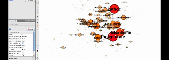
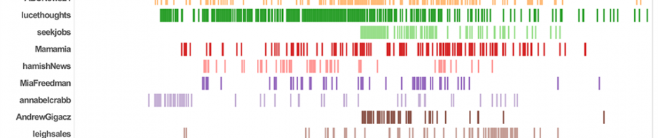
Posts Tagged ‘#spill’

Some New Publications

As 2011 winds down (which may also give me the time to do some more Gawk coding again – watch out for more updates soon), we’re still in the process of harvesting the results of our work over the last twelve months. Over the past few weeks, a clutch of articles based on our Mapping Online Publics research have finally seen the light of day:

Read the rest of this entry →

15

12 2011

Twitter Events in Perspective (updated)

Regular readers of this blog will know that we’ve now examined Twitter activity around a number of recent events in some detail – from the Labor leadership spill in Australian politics in June 2010 through to the subsequent election, to the recent floods in Queensland and beyond. On that basis, we now also in a position to make some comparisons between these events: in the first place, to examine how they unfolded, and how much of the wider Twitter userbase they’ve been able to mobilise.

So, building on the work we’ve already done, and adding a few more case studies into the mix, here’s an overview of activity within selected Twitter #hashtags – in each case, over the course of their most active day. The process is similar in each case: retrieve a full #hashtag archive from Twapperkeeper, run our explodetime.awk Gawk script over the data to identify daily and hourly activity, then pick the 24 hours during which the volume of tweets in the #hashtag was most significant.

Read the rest of this entry →

10

02 2011

#ausvotes Twitter Activity during the 2010 Australian Election

(Crossposted from snurb.info, where you can find my full coverage of ECREA 2010.)

Hamburg.
My own paper was next at ECREA 2010. Here’s the presentation – and I also recorded the audio for it, and will add it as soon as I can which is now attached to the slides. As it turned out, one of the other presenters in the session also broadcast the whole event to Justin.tvso go there to see it all in action (my presentation starts around 52 minutes in, and you can also see the other papers on our panel)…

17

10 2010

Fun with Gephi’s new dynamic visualisation feature

This is a quick demo of how the new timeline feature works in Gephi 0.7 beta. We’ve used 5 hours worth of @reply data from the Twapperkeeper archives for the #spill hashtag. This period corresponds to the ‘acute event’ in Australian politics that kicked off the election that sidetracked our research (in all kinds of productive ways, of course) – the day (the evening, and then the next morning) when now-PM Julia Gillard overthrew then-PM Kevin Rudd. Please don’t read too much (or indeed anything) into the actual analysis here, but for the sake of completeness: I’ve indicated betweenness centrality with both colour (red at the high end, yellow at the low end) and size.

The possibilities here are very interesting, particularly if we use better quality data that is properly set up for longitudinal analysis – e.g. so the nodes scale up and down properly through time. I’m pretty sure Axel has one of his epic and highly detailed methods posts up his sleeve in relation to all this, but for now, enjoy the pretty moving pictures – and apologies for the jerky cursor movements – I’m on the road and so without a mouse.

If you’re interested in any of the detail it is probably best viewed at the YouTube website in HD and fullscreen:

06

10 2010

Creating Twitter Timelines from Twapperkeeper Data

This is the first in what will be an irregular series of methods posts outlining some of our approaches to working with datasets from various sources. Part of our work over the next few weeks will be to examine what happens in the Australian Twittersphere around the upcoming federal election, so I figured it would be a good idea to start with some of the basics of working with Twapperkeeper data. (Note that what I’ll outline here is a working solution, but not necessarily an elegant one – if anybody has a better suggestion, we’d love to hear it.)

Twapperkeeper is an online tool for capturing (public) tweets that contain specific #hashtags, keywords, or @usernames. The datasets it creates are delivered in a standard comma-separated value (CSV) format – including fields such as the tweet itself, the username of the poster, and a timestamp in various formats, as well as a few other bits of backend information.

One of the most immediate points of interest in working with a Twapperkeeper dataset is often to get a sense of the tweet timeline: how does the volume of tweets change over time, for example in response to events occurring in the world? The datasets provide that information – but to create an accurate visualisation of the timeline needs some doing. In this post, I’m going to work through an example, using Twapperkeeper data collected by my colleague Jean Burgess during the recent Australian Labor Party leadership spill (centred around the #spill hashtag and a few related ones).

Read the rest of this entry →

22

07 2010